The market’s performance over the past month reflects a mixed picture of resilience and weakness. While the S&P 500 remains in a bullish structure and has held above key support levels, a closer look reveals significant divergence beneath the surface. Market breadth has deteriorated, with the average stock performing much worse than the index itself. This disparity highlights a challenging environment, where strength in a few large-cap stocks masks broader market struggles—a theme that will be explored throughout this newsletter.
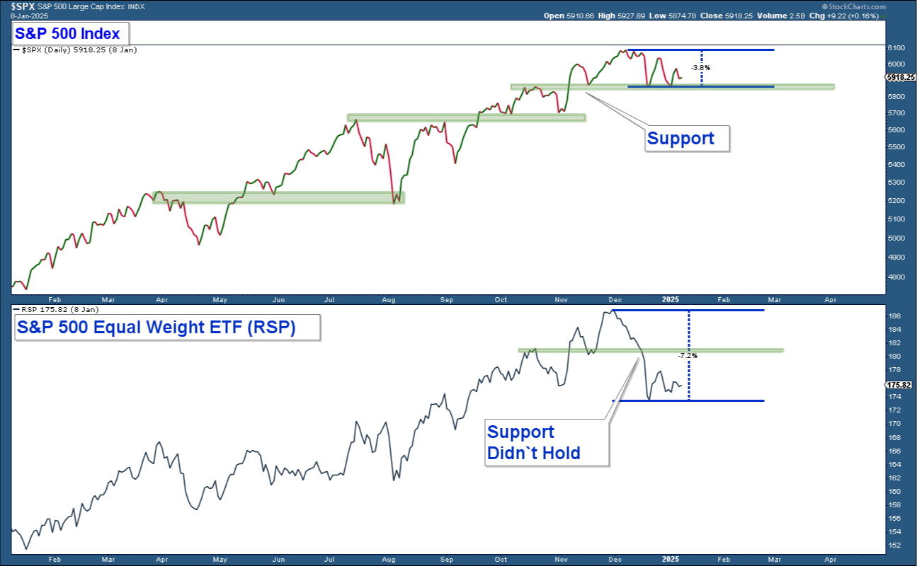
Over the past month, the market has experienced a pullback, with the S&P 500 declining approximately 3.8% from its recent highs. In the chart’s top panel, we see that the index remains above a critical support level that has been tested three times over the past six weeks. This support level has so far held.
In contrast, the equal-weighted S&P 500, shown in the lower panel, paints a less bullish picture. The average stock within the index has performed worse, declining roughly 7.2% from its highs. While the equal-weighted index had a similar support level to the S&P 500, it has decisively broken below that level, highlighting the current weakness in market breadth.
If the S&P 500 were to fall decisively below its support level, it would signal near-term market weakness and represent a meaningful shift in market dynamics. Such a move would disrupt the market’s bullish structure, which has been characterized by a consistent pattern of higher highs and higher lows over the past year. The market has shown strength by repeatedly holding support during prior pullbacks, but a break below this level would indicate a change in that pattern.
It is important to note that this potential breakdown would not necessarily signal an impending crash or a transition into a bear market. However, it would suggest increased caution, as the market’s ability to sustain its uptrend would come into question. In such a scenario, adopting a more defensive stance until conditions improve would be prudent. This underscores the importance of closely monitoring market behavior at this key juncture.
Market Breadth: S&P 500 vs. Stocks Above Their 200-Day Moving Averages
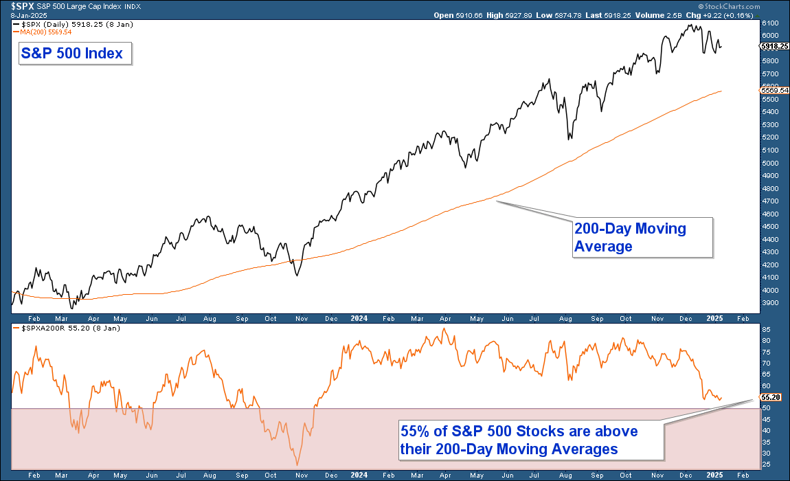
The second chart emphasizes the disconnect between the S&P 500's performance and the underlying participation of its constituent stocks, providing further evidence of poor market breadth.
In the top panel, the S&P 500 is shown sitting well above its 200-day moving average, demonstrating relative strength at the index level. Despite a pullback from its highs, the S&P 500 remains in a bullish posture, staying comfortably above this widely-watched moving average, which often serves as a long-term trend indicator.
However, the lower panel reveals a starkly different story for the broader index components. Currently, only 55% of stocks within the S&P 500 are trading above their respective 200-day moving averages. This means nearly half of the stocks in the index are in a longer-term downtrend, despite the S&P 500 itself maintaining a bullish structure.
This divergence highlights a critical theme: while the S&P 500’s performance is buoyed by the strength of a smaller subset of large-cap stocks, the broader market has struggled. Poor market breadth of this kind can be a warning sign, as sustained market advances typically require broader participation across a larger number of stocks.
Technical Overview: Support Levels and Momentum Indicators
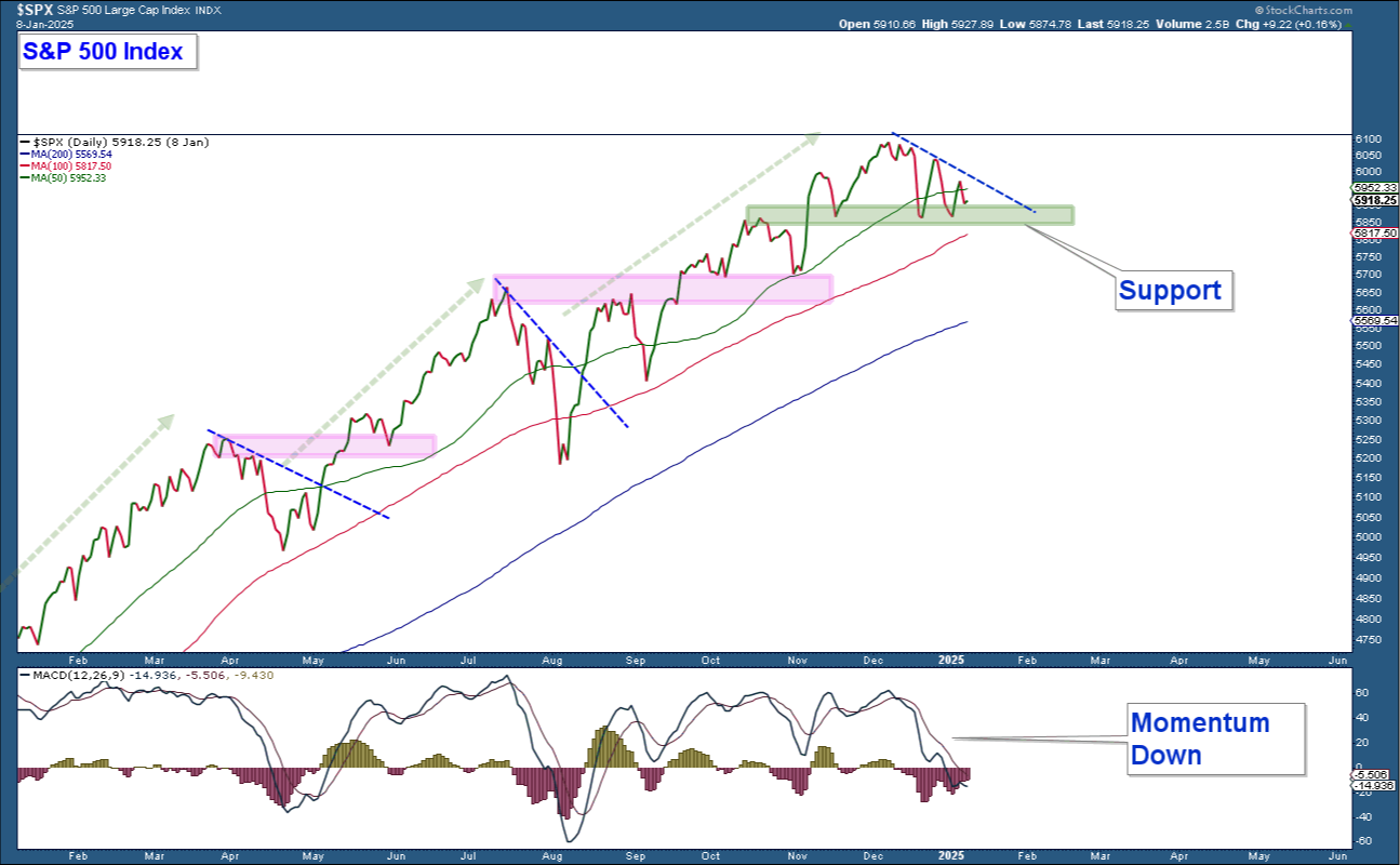
The third chart provides a detailed technical view of the S&P 500's current position relative to its key moving averages and MACD momentum indicator.
In the upper panel, the S&P 500 is displayed alongside its 200-day, 100-day, and 50-day moving averages, with a thick green line marking the critical support level where the index has bounced multiple times over the past six weeks. Notably, this chart also highlights two prior instances (pink lines) where similar support levels held, reinforcing the importance of this zone as a pivotal point for the market.
The lower panel displays the MACD (Moving Average Convergence Divergence) momentum indicator, which is trending lower and sits below zero. This signals that downside momentum has been building, raising concerns about the potential for further weakness.
The implications of this chart hinge on the market’s next move:
- If support holds and the S&P 500 moves higher, this would be a bullish development, particularly if accompanied by improved market breadth. It would signal a resumption of the longer-term uptrend and reinforce the strength the index has displayed throughout the past year.
- If the index falls decisively below support, it would mark a departure from the bullish pattern of holding above key support levels seen over the past year. Such a move would suggest near-term market weakness and indicate that caution is warranted. While this wouldn’t necessarily signal a crash or the onset of a bear market, it would reflect a change in the market’s dynamic, encouraging a more defensive stance until conditions improve.
This chart underscores the importance of the current support level as a key inflection point. The market’s response here will likely set the tone for its near-term direction.
Analyzing Market Oscillation: Overbought/Oversold Indicator
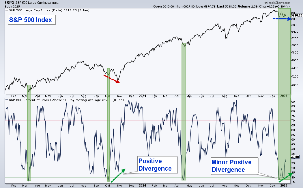
The final chart provides insight into the relationship between the S&P 500 and its short-term market breadth, as measured by the percentage of stocks within the index trading above their 20-day moving averages.
In the upper panel, the S&P 500 is shown moving sideways over the past few weeks at support. In the lower panel, the oscillator depicts the percentage of stocks above their 20-day moving averages, which has historically been a reliable overbought/oversold indicator.
This indicator has effectively predicted three prior market pullback bottoms over the past two years, although with some variation in timing. For example, during the October 2024 pullback, the line dropped below 10%, signaling oversold conditions. While the index fell to a lower low afterward, the oscillator formed a higher low - a positive divergence that ultimately preceded a strong market recovery.
Currently, a similar pattern is emerging. While the S&P 500 has held support and moved sideways, the oscillator has formed a higher low and is now advancing, reaching the 32% level. This positive divergence between the index and the oscillator is an encouraging sign that suggests support could hold again if historical patterns repeat.
However, it’s essential to note that this is just one indicator among many, and the market's near-term direction will depend on a variety of factors. One such factor is the upcoming employment report, scheduled for release tomorrow morning before the market opens. This highly anticipated report has the potential to significantly influence market movements in the near term.
Current Account Update
Given current market conditions, our accounts maintain a somewhat reduced equity allocation. Currently, equity exposure stands at approximately 60% of what would be considered a fully allocated position. This approach reflects a cautious stance, with our total equity allocation approximately 40% below a fully invested level.
If the market bounces off support and conditions improve, I plan to increase our equity exposure to take advantage of strengthening trends. Conversely, if the market decisively breaks below support and conditions deteriorate, I will likely adopt a more defensive posture in the short term to protect against potential downside risk.
This dynamic approach ensures that portfolio allocations remain aligned with evolving market conditions, balancing opportunities for growth with prudent risk management.
