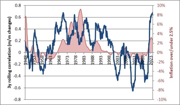
I am continually fascinated by how many second-order ‘understandings’ are missed, even by those people who have a really good first-order understanding of finance. For example, every financial advisor understands that bonds are less volatile than stocks. Most financial advisors understand that stocks and bonds in a portfolio together also benefit because they’re not correlated. Some financial advisors, and most CTAs, understand that diversifying a portfolio works because when you add uncorrelated assets together, the risk of the whole is less than the sum of the risks because of the offset from the correlation effects. Those are all coarse understandings that any financial professional should ‘get.’ However, it is fairly unusual for advisors or even CTAs to understand that the correlation of stocks and bonds undergoes a state shift when inflation get above about 2.5% for a few years, and become correlated, and that means more risk for the same combination of stocks and bonds. Here’s that chart I love to show, updated through the end of the year.
While that’s an example of a ‘second-order understanding’ that isn’t widely known, it isn’t what I want to write about today. Actually, for a change what I want to discuss is something that has nothing directly to do with inflation, and that is the effect of volatility on asset allocation.
This is an important discussion right now, because whether or not you have gotten the message yet that President Trump is going to be much more Machiavellian in his approach to the global world order than prior Presidents have been – and whether you think that’s a good thing or a bad thing – you surely must have noticed that the volatility of the markets under this regime is likely to be somewhat higher than under Sleepy Joe and also higher than it was during Trump’s first term. And that leads to the second-order understanding about what that implies for markets. Hang with me here; if you’re not a finance person this gets a little hairy.
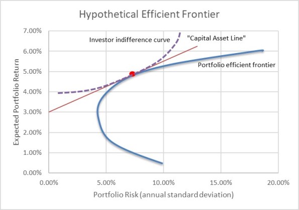
The next chart shows Modern Portfolio Theory on one chart.
The blue line is the Markowitz efficient frontier: every point on the line represents a portfolio of assets that is the least-risky for that level of expected return. So, the highest vertical point is a portfolio of 100% in the asset with the highest expected return…you can’t get more return without leverage.[1] In this case, let’s assume that is equities. As you go down the curve, you allocate more to other less-risky assets and give up some portfolio return. Because assets are not 100% correlated, you can always get a portfolio that has at least as good (and usually better) returns for a unit of risk than any single asset – that’s the benefit of diversification. As you get to very low expected returns, you get to the part of the curve you’d have to be irrational to be on because you get higher risk and lower returns, and so we usually ignore that part of the curve that bends back.
The red line is popularly called the “Capital Asset Line.” Assuming there is some zero-risk instrument (that’s not already in the assets we’ve considered, so there’s some hand-waving here) and you can both borrow and invest at that rate, you can think of a portfolio that is the ‘best’ portfolio on the blue curve, either combined with the zero risk instrument (sliding down the red line to the left) or levered at the zero risk instrument (moving up the red line to the right). The ‘best’ portfolio here is defined as the place where the red curve is tangent to the blue curve.
A lot of times you’ll just see those two lines, but it doesn’t answer the question of which portfolio an actual investor prefers. It turns out that investors do not have linear risk preferences…that is, if I make my portfolio 10% more risky, perhaps I require 1% more return but if I make it another 10% risky, I’m going to need more than 1% additional return. I’m not only risk averse, but I get more risk averse the larger the potential risks. [Lots of experimental data on this. If I offer you a bet where you pay me $1 and on the basis of a coin flip I will either pay you $2 or $0, you are much more likely to take that bet than if I offer you a bet where you are risking $10,000 for the chance at $20,000…or zero]. So the purple dotted line is a hypothetical ‘investor indifference curve’. I just made up that term because I can’t remember what the theoreticians call it. The curve represents all of the combinations of risk and return that make the investor equally happy. So, the best portfolio for this investor is where the purple line – the highest purple line we can find, indicating the MOST happiness – touches the red line.
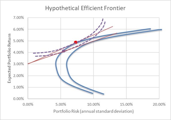
With me? Now consider the next chart. All I have done here is to increase the risk of every asset and shift the whole portfolio efficient frontier to the right.
What happens? The Capital Asset Line (red) now flattens out. And that means that the prior purple line no longer has a point of tangency. We have to go to a lower purple line, and since the purple line is concave upward the red line becomes tangent to the purple line at a point further to the left (the slope of the red line is flatter, and the flatter parts of the purple line are to the left). I’ve put the new ‘optimal portfolio’ as a dot in purple.
The implication is this: if overall risk in markets is perceived to have permanently increased, then rational investors will move from portfolios with more risky assets to portfolios with fewer risky assets.
You probably could have guessed that without all of the curves. If I am comfortable with a certain amount of risk, and the overall risk of things goes up, then it stands to reason that I’d work to reduce my overall risk. The second-order understanding here is, then, that if President Trump is perceived by investors to increase the overall volatility in markets and individual country and company outcomes, we should expect investors to lighten up on equities.
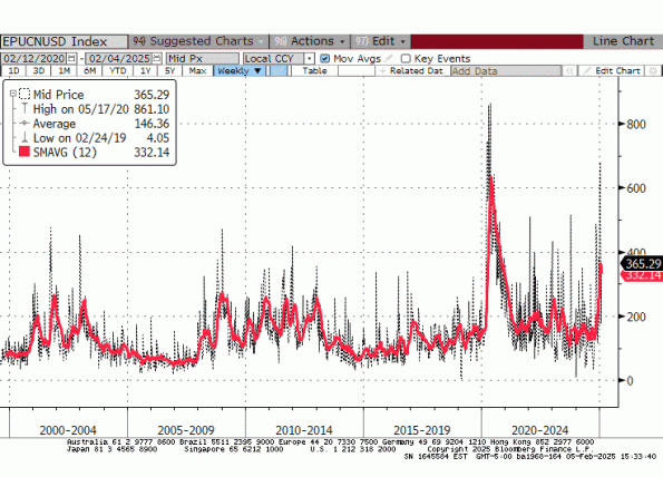
And that brings me to the final chart. This is the Baker, Bloom and Davis news-based Economic Policy Uncertainty Index, which counts the number of articles in US-based news sources that contain a set of predefined terms that indicate uncertainty about economic policy. The dotted lines below show weekly data; the heavy red line shows the 12-week moving average to get rid of the noise.
Notice the three prior spikes on the chart are during and immediately following the end of the internet/stock market bubble in the early 2000s, the end of the housing bubble and the Global Financial Crisis in 2008-09, and the COVID crisis. All three of those episodes were associated with significantly lower markets, although you could argue that harsh bear markets might trigger some policy uncertainty (that certainly happened after 2008). The jump on the right is the Trump jump, and it is already higher than any other period on this chart other than COVID.[2] Volatility we have. Uncertainty we have. And even if you like the President’s policies, the volatility means that we should not be surprised to see investors pull some chips off the table.
[1] If you take this best-returning asset and leverage it, you basically get a straight line going up and to the right forever; the slope of the line depends on the cost of leverage.
[2] Incidentally, the index goes back to about 1985 and although I didn’t show it there are two more bumps that are similar to the leftmost two on this chart: around the 1993 recession, and around the time of the stock market crash in 1987. They are all lower than the Trump jump.


